The essentials for putting together anything on-brand for Paidvine — quick reference for partners and internal use.
Use the SVG wherever possible for crisp scaling. The icon works for favicons and small square placements.

Same file — confirm contrast before use on dark green surfaces.
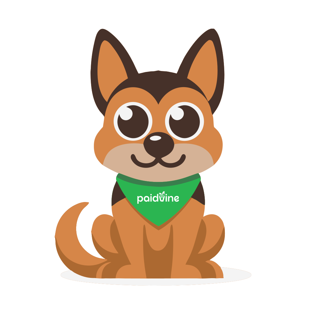
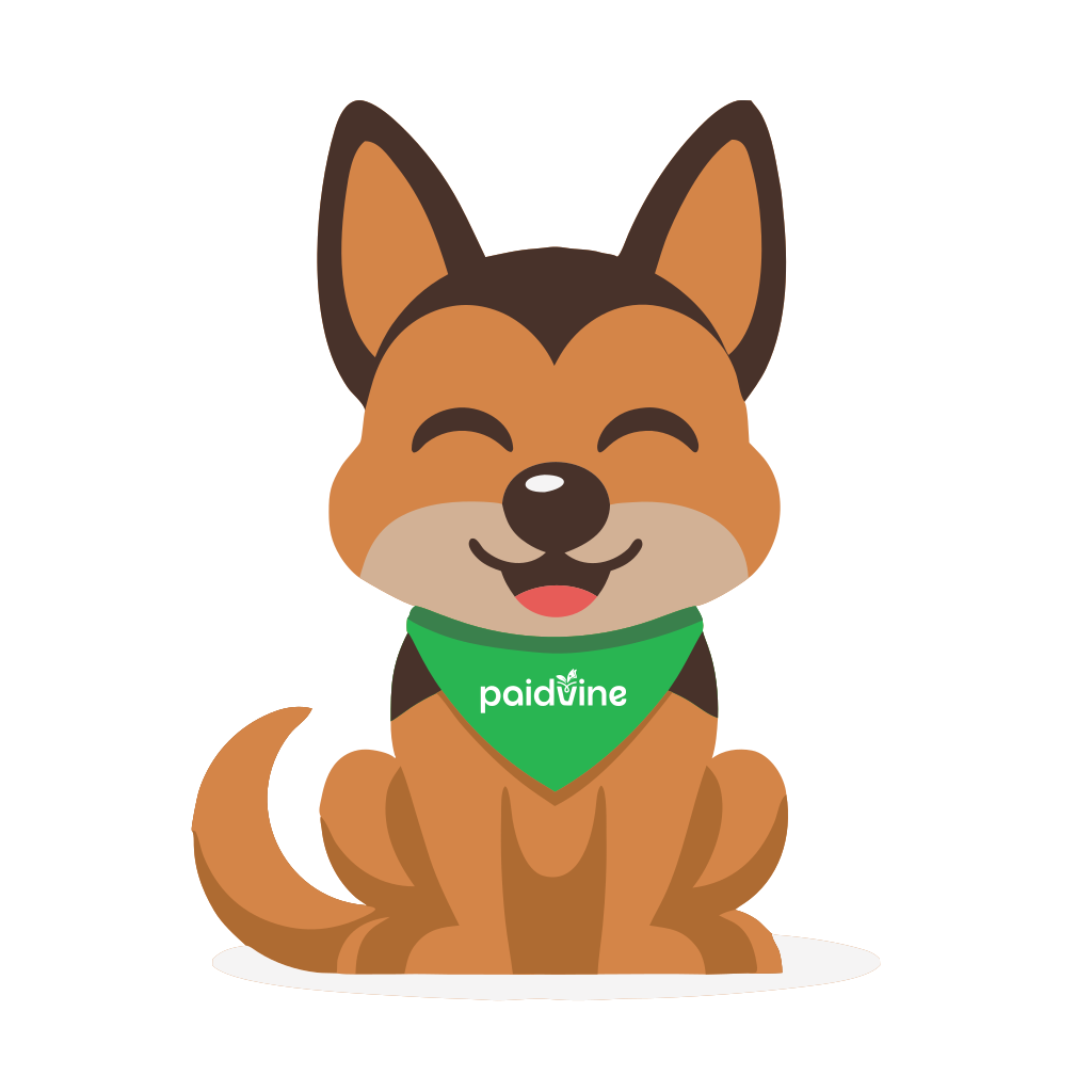
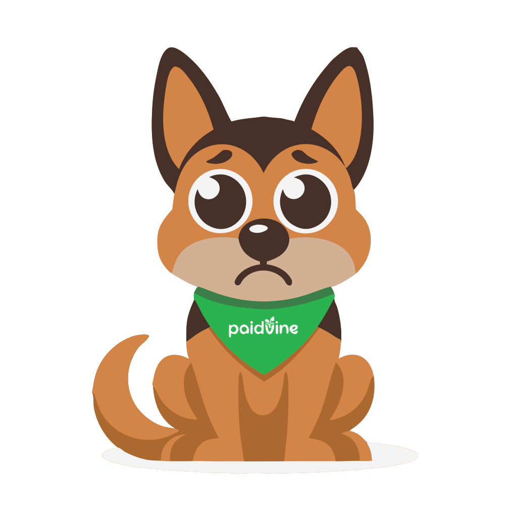
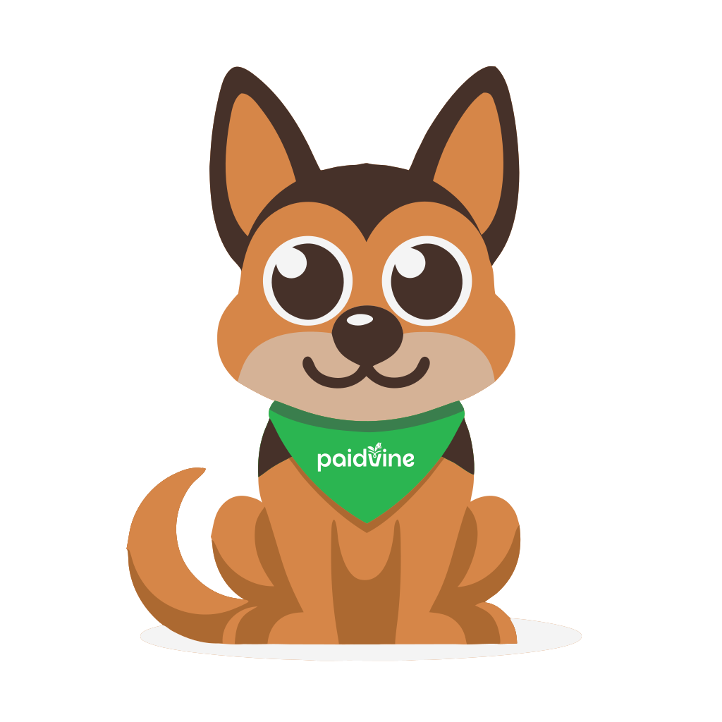
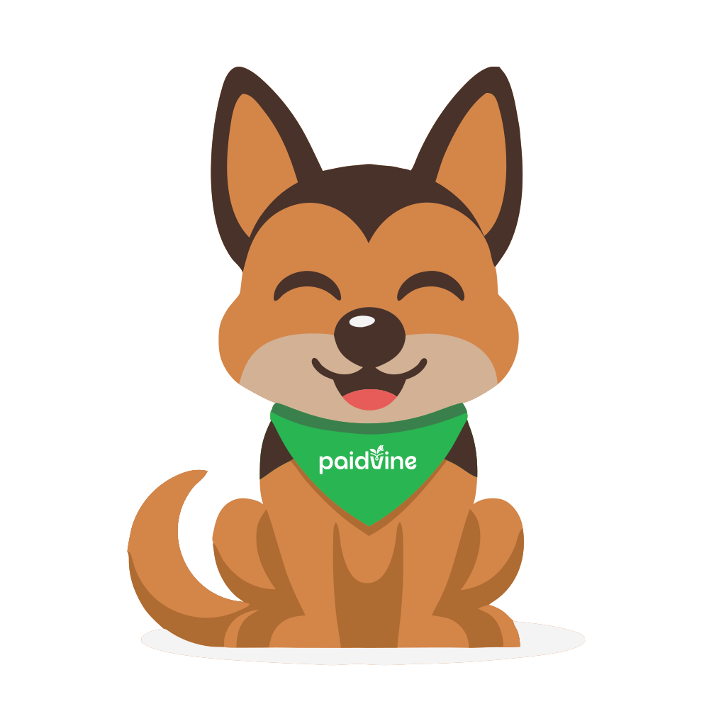
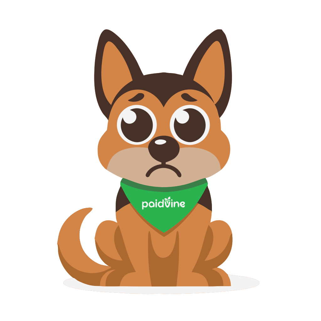
Download SVG Download PNGMaggi is the Paidvine mascot — use these expressions for empty states, confirmations, errors, and friendly moments throughout the product.
Green is the core brand color across the app — buttons, active states, and highlights. Yellow is a secondary accent used sparingly (streaks, badges).
#56B03F
#72D559
#418A2F
#275534
#FEC816
#F8FAFC
#1A1A1A
Raleway carries headings, Inter carries body copy and UI text — the same pairing used throughout the app.
Body Large — 17px, for intros and lead paragraphs.
Body — 15px, the default paragraph size across the app.
Body Small — 14px, for secondary text.
Caption / Overline — 12px, labels & tags
A portable stylesheet for building on-brand pages outside the app, and a prompt for briefing other AI tools on the brand. Copy inline or download the file.
CSS custom properties, type scale, and base element styles — drop into any static page or prototype.
Download CSS/* ============================================================
PAIDVINE — BRAND STYLESHEET
Colors, type, and base element styles for anything built
outside the core app (landing pages, microsites, emails).
============================================================ */
@import url('https://fonts.googleapis.com/css2?family=Inter:wght@400;500;600;700&family=Raleway:wght@600;700;800&display=swap');
:root {
/* Brand green */
--pv-green: #56B03F; /* primary — buttons, links, active states */
--pv-green-light: #72D559; /* lighter accent, hover highlights */
--pv-green-dark: #418A2F; /* hover / pressed states, on-light text */
--pv-green-deep: #275534; /* deepest green — dark surfaces, footers */
/* Accent */
--pv-yellow: #FEC816; /* secondary accent — badges, streaks, highlights. Use sparingly. */
/* Neutrals */
--pv-bg: #F8FAFC; /* page background */
--pv-paper: #FFFFFF; /* card / surface background */
--pv-ink: #1A1A1A; /* primary text */
--pv-ink-soft: #64748B; /* secondary / muted text */
--pv-line: #E2E8F0; /* borders, dividers */
}
/* ---------- Base ---------- */
html {
-webkit-text-size-adjust: 100%;
}
body {
margin: 0;
background: var(--pv-bg);
color: var(--pv-ink);
font-family: "Inter", -apple-system, BlinkMacSystemFont, sans-serif;
font-size: 0.9375rem; /* 15px */
line-height: 1.7;
font-weight: 400;
-webkit-font-smoothing: antialiased;
-moz-osx-font-smoothing: grayscale;
}
/* ---------- Headings — Raleway ---------- */
h1, h2, h3, h4, h5, h6 {
font-family: "Raleway", sans-serif;
font-weight: 700;
line-height: 1.25;
letter-spacing: -0.01em;
color: inherit;
margin: 0;
}
h1 { font-size: clamp(1.75rem, 4vw, 3rem); line-height: 1.2; }
h2 { font-size: clamp(1.375rem, 3vw, 2rem); line-height: 1.3; }
h3 { font-size: clamp(1.125rem, 2vw, 1.375rem); line-height: 1.4; font-weight: 600; }
h4 { font-size: clamp(0.9375rem, 1.5vw, 1.125rem); line-height: 1.5; font-weight: 600; }
h5 { font-size: 0.9375rem; line-height: 1.5; font-weight: 600; }
h6 { font-size: 0.875rem; line-height: 1.5; font-weight: 600; }
/* ---------- Body copy & UI — Inter ---------- */
p { font-size: 0.9375rem; line-height: 1.7; font-weight: 400; margin: 0 0 1em; }
label, span, small, a, button, input, select, textarea {
font-family: "Inter", sans-serif;
font-size: inherit;
}
small { font-size: 0.75rem; line-height: 1.5; }
a { text-decoration: none; color: var(--pv-green-dark); }
a:hover { text-decoration: underline; }
/* ---------- Typography utility classes ---------- */
.type-display { font-family: "Raleway", sans-serif; font-size: clamp(2rem, 5vw, 3.5rem); font-weight: 700; line-height: 1.1; letter-spacing: -0.02em; }
.type-h1 { font-family: "Raleway", sans-serif; font-size: clamp(1.75rem, 4vw, 3rem); font-weight: 700; line-height: 1.2; letter-spacing: -0.015em; }
.type-h2 { font-family: "Raleway", sans-serif; font-size: clamp(1.375rem, 3vw, 2rem); font-weight: 700; line-height: 1.3; letter-spacing: -0.01em; }
.type-h3 { font-family: "Raleway", sans-serif; font-size: clamp(1.125rem, 2vw, 1.375rem); font-weight: 600; line-height: 1.4; }
.type-h4 { font-family: "Raleway", sans-serif; font-size: clamp(0.9375rem, 1.5vw, 1.125rem); font-weight: 600; line-height: 1.5; }
.type-body-lg { font-family: "Inter", sans-serif; font-size: 1.0625rem; line-height: 1.7; font-weight: 400; }
.type-body { font-family: "Inter", sans-serif; font-size: 0.9375rem; line-height: 1.7; font-weight: 400; }
.type-body-sm { font-family: "Inter", sans-serif; font-size: 0.875rem; line-height: 1.6; font-weight: 400; }
.type-caption { font-family: "Inter", sans-serif; font-size: 0.75rem; line-height: 1.5; font-weight: 500; }
.type-overline { font-family: "Inter", sans-serif; font-size: 0.6875rem; font-weight: 600; letter-spacing: 0.1em; text-transform: uppercase; }
/* ---------- Buttons ---------- */
.pv-btn {
display: inline-flex;
align-items: center;
gap: 8px;
padding: 12px 24px;
border-radius: 8px;
font-family: "Inter", sans-serif;
font-weight: 600;
font-size: 0.9375rem;
text-decoration: none;
border: 1px solid transparent;
cursor: pointer;
transition: 0.2s ease-in-out;
}
.pv-btn-primary { background: var(--pv-green); color: #fff; }
.pv-btn-primary:hover { background: var(--pv-green-dark); text-decoration: none; }
.pv-btn-outline { border-color: var(--pv-green); color: var(--pv-green-dark); background: transparent; }
.pv-btn-outline:hover { background: #EAF7E5; text-decoration: none; }
/* ---------- Surfaces ---------- */
.pv-card {
background: var(--pv-paper);
border: 1px solid var(--pv-line);
border-radius: 16px;
box-shadow: 0 10px 30px rgba(14, 59, 44, 0.08);
}
.pv-badge {
display: inline-block;
font-size: 0.6875rem;
font-weight: 600;
letter-spacing: 0.06em;
text-transform: uppercase;
padding: 4px 10px;
border-radius: 999px;
background: var(--pv-yellow);
color: var(--pv-ink);
}
Paste into an image generator, design tool, or coding agent to brief it on colors, type, voice, and logo usage.
Download Prompt# Paidvine Brand Prompt
Paste this into another AI tool (image generator, design assistant, coding agent, etc.) when asking it to produce something on-brand for Paidvine.
---
You are creating a design or asset for **Paidvine**, a consumer survey rewards platform. Follow these brand guidelines:
**Colors**
- Primary green (buttons, links, active states): `#56B03F`
- Light green accent (hover highlights, secondary UI): `#72D559`
- Dark green (hover/pressed states, text on light backgrounds): `#418A2F`
- Deep green (darkest surfaces — footers, dark hero sections): `#275534`
- Yellow accent (badges, streaks, small highlights only — use sparingly, never as a primary color): `#FEC816`
- Background: `#F8FAFC` (very light slate, not pure white)
- Primary text: `#1A1A1A`
- Secondary/muted text: `#64748B`
- Borders/dividers: `#E2E8F0`
**Typography**
- Headings: **Raleway**, bold (700 weight), tight line-height
- Body copy and UI text (buttons, labels, inputs): **Inter**, regular (400) to semibold (600)
- Do not substitute a serif font or a different sans-serif for either role — Raleway/Inter is the fixed pairing
- Do not use a system-font stack (e.g. -apple-system) as the primary typeface; load Raleway and Inter explicitly
**Voice and tone**
- Direct, transparent, no hype — Paidvine's core differentiator is paying real cash (not points), so copy should lean into plainness and trustworthiness rather than excitement or urgency
- Avoid superlatives ("best," "amazing," "revolutionary") and countdown/urgency tactics
- Speak to two audiences depending on context: consumer panel members (earning cash for surveys) and B2B partners/affiliates (driving referral traffic)
**Logo**
- Primary logo: `images/logo.svg` (also available as `logo.png`)
- Favicon/icon: `images/icon.svg` (also available as `icon.png` / `icon.ico`)
- Maintain clear space around the logo; do not recolor it, add effects/shadows, or stretch it
- Confirm contrast before placing on a dark green background — verify legibility rather than assuming it works
**Layout conventions**
- Generous whitespace, rounded corners (8–20px radius depending on element size)
- Buttons: pill or rounded-rect, primary green fill with white text, or outlined variant with green border on light backgrounds
- Cards: white surface, light border (`#E2E8F0`), soft shadow — avoid heavy drop shadows or harsh borders
**What to avoid**
- Any color outside this palette as a primary/dominant color (no purples, blues, oranges, teals as brand colors)
- Playful mascots, cartoon illustrations, or a "gamified points" visual language — Paidvine's whole positioning is *against* points-based reward systems
- Stock photography that looks generic/corporate; prefer clean UI mockups, real product screenshots, or simple iconography